A picture may be worth a thousand words, but what is a graph worth? The graph below, described as "the map that made a nation cry", depicts Napoleon's failed invasion of Russia in 1812.
The wide tan swath shows his Grande Armée, almost half a million strong, marching East to Moscow; the black trickle shows the few who straggled back. It's an elegant fusion of geography, time, and temperature into a single statement of military disaster.
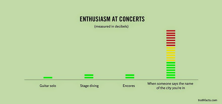
Infographics has come along way since the 1800s. Now, using modern tools of analysis, like circles and the color blue, we can get an even clearer picture of history:





 Î
Î